How to color calibrate your monitor in Linux
by John Been October 13, 2018 · Apps per category / Graphics / How to / Latest blog / Photographer / Photography / Video / Videographer
Are you a professional photographer, image maker, video editor or digital matte painter? Or are you just passionate about your your personal digital art? If you are really serious about the quality of your creations, it is very important that your monitor displays colors accurately and with the correct brightness, tone and intensity. Consider what the impact might be if you unconsciously set your computer screen too dark. Then your photo or piece of art seems darker than it actually is. Then you adjust the brightness of the photo mistakenly to the bright side of the spectrum to make it visually match what you expected in your head. If you now have the photo or artwork printed at a professional lab, the end result will be an overexposed image. And this is just one aspect of monitor and color related improvement options. To avoid these kind of nasty surprises, you should calibrate your monitor. In this blog I will describe how to color calibrate your monitor in Linux.
The objectivity versus the subjectivity of color
For everyone involved in graphical applications, the correctness of color is one of the pillars on which the quality of your output rests. Color is basically a physical fact, but is put under pressure by biological influences, so that color is experienced differently by different people. People who are color blind are often treated with a lot of laughter, but how do people who think that they see colors correctly are indeed sure that this is indeed the case. And how do we define what is correct? Even if you show several people who are not color-blind to the same color palette, they can interpret them all differently. It has everything to do with how our individual brain processes optical signals.
Do you remember the viral discussion about the blue and black striped dress? One of the many studies concluded that 31% of a large test group did indeed see the colors blue and black, but that 69% mistakenly perceived the colors as white and gold. And an important part of this misconception is the ambient light that fell on this dress.
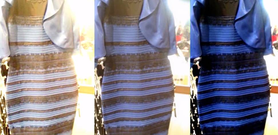
But while the ambient light plays an important factor in the interpretation of color, the interpretation of color is debatable even in a controlled environment where ambient light does play a lesser important role, such as an image on paper or on a computer screen, and the brain can still be fooled.
For example, look at the image below:
Source: https://www.memecenter.com/fun/766986/color-mindfuck
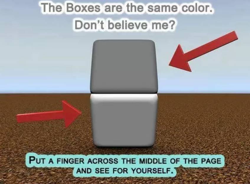
Or take a look at the following image:
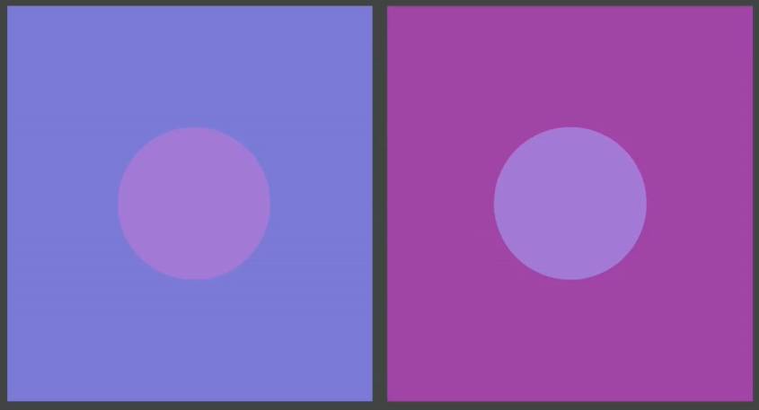
Source: Youtube channel ColorPlaza TV (https://www.youtube.com/watch?v=fq-kNtwifFk)
Most people would say that the circles do not have the same color. But if we bring the circles together we see the opposite.
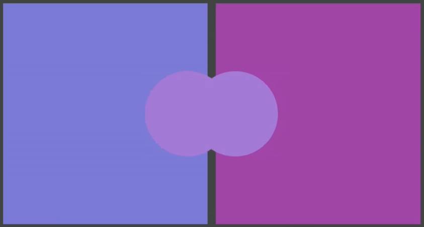
Source: Youtube channel ColorPlaza TV (https://www.youtube.com/watch?v=fq-kNtwifFk)
So now we have been able to draw the conclusion that color and its perception depend on many factors. But if you are serious about image editing, then you want to minimize that subjective part. And for that we need color management.
What is color management
If you want to be sure of the quality of the output of your artistic creations, then you must ensure that you remove the discussion about colors from the subjective spectrum. So we are talking about the objectification of color. And you achieve that through color management. Color management is the whole of theory, processes and tools to make the interpretation of color objective. The connecting factors herein are what is called an ICC color profile and a LAB color space.
ICC profiles are numerical tables that contain the characteristics of the devices involved in color. We are talking specifically about cameras, scanners, monitors and printers. ICC profiles are designed according to the ICC standard that is drawn up and distributed by the International Color Consortium.
Cameras, scanners and monitors use an RGB color model and printers use a CMYK color model. In addition to the fact that we can link a specific color profile to devices such as a monitor or a printer, we also need a tool to enable these profiles to communicate properly with each other. This is based on the LAB color model, where the LAB (L=Lightness, A=Cyan to Magenta, B=Blue to Yellow) model is a scientific model where colors are defined as absolute. There is no other model that contains more colors than the LAB color space. This means that it is an independent model that functions as a reference, where the LAB color space is the only way to communicate different colors across different devices.
A picture probably makes this whole process a lot clearer.
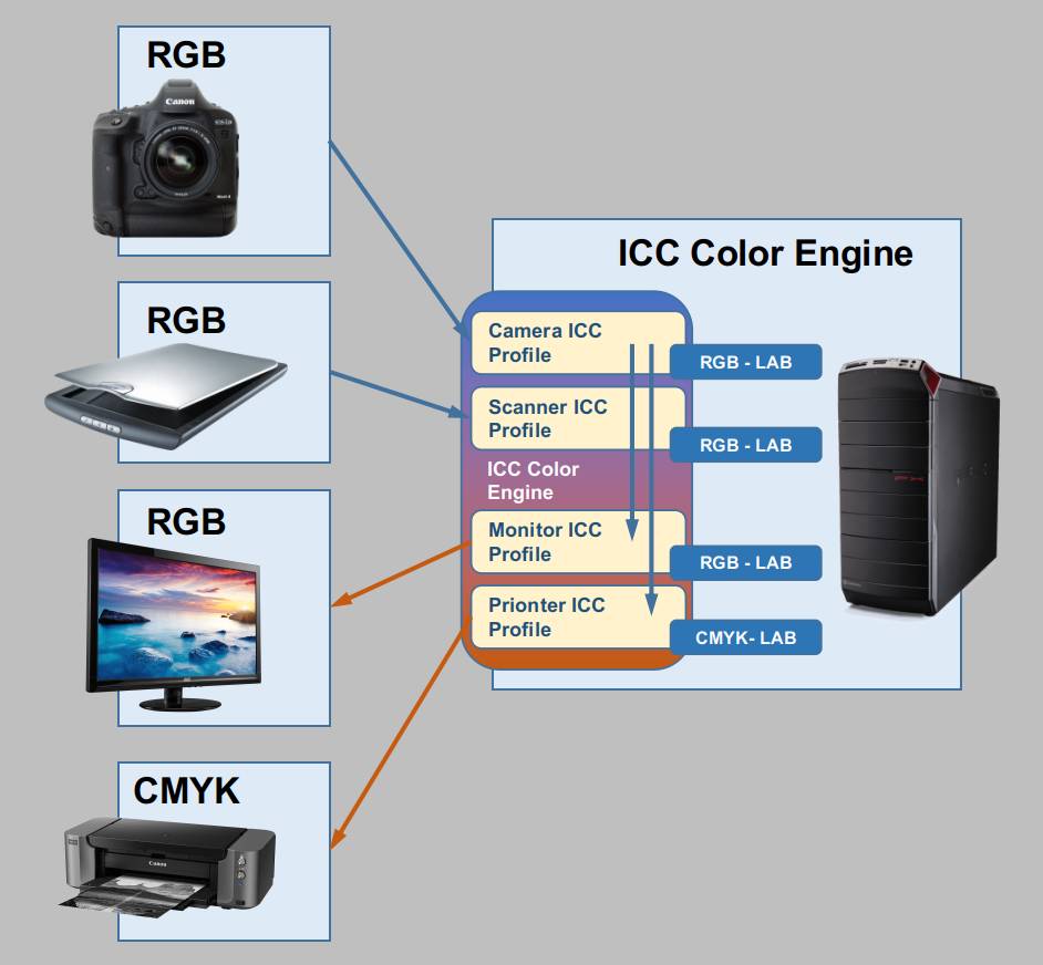
Source: ColorPlaza TV / https://www.youtube.com/user/boudy1966/videos
On your computer you need a piece of functionality that functions as a color engine in the software you use, such as in GIMP. So the software that you use must be able to deal with color management. Some applications handle that automatically and in other applications you have a lot of freedom to set things yourself. A color engine uses the information stored in the various ICC profiles. The color engine ensures that the ICC profile of the camera is read. The engine then ensures that, based on the ICC profile of the computer monitor that is read in, the correct RGB color translation is returned to the monitor by mapping the ICC profiles of both devices via the LAB scientific color model. And the same thing happens by returning a correct CMYK translation to the printer based on the ICC profile of the printer. So the LAB reference model is used to equip the individual devices with the correct color models via the individual ICC profiles.
If you want to read more on color management check these out:
How to create an ICC profile for your monitor in Linux
Color management does not only concern your monitor. If you really want to take it seriously then you calibrate all components in your workflow, including your monitor, but also your camera and your printer, so that you have optimal alignment in your graphical pipeline. But more and more photographers and digital artists use printing services at external print houses. In addition, profiling your printer requires different measuring instruments than those for your monitor. And this deserves it’s own separate blog post. So let’s not take the profiling of the printer into consideration in this blog. We also leave the profiling of the camera in this blog out of consideration, as it again deserves a completely different post. So we start from the files delivered standard from the camera. In this blog post I focus purely on calibrating and profiling the computer screen.
What do you need to color calibrate your monitor in Linux
Monitor calibration consists of a software component and a hardware component. You need to have access to calibration software, which in our case should be the free and open source software DisplayCAL. And you need a hardware device which is called a colorimeter. This calibration tool determines directly from the screen the right luminosity and contrast and the results of the measurements will be written by the calibration software in an ICC profile. To make this process possible the software will display a range of different colors on the monitor that the colorimeter will measure.
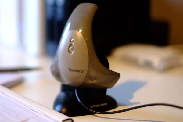
There are multiple options for colorimeters out there that work perfectly with Linux. I use an old Spyder 3 pro myself which works great.
If you are interested in this golden oldie you can still buy the Spyder 3 pro.
There is even a real open source calibration device available, the ColorHug.
https://hughski.com/
The following examples of colorimeters works perfectly with Linux, but there are more colorimeters out there that will work fine as well with Linux.
- Gretag-Macbeth i1 Pro (spectrometer)
- Gretag-Macbeth i1 Monitor (spectrometer)
- Gretag-Macbeth i1 Display 1, 2 or LT (colorimeter)
- X-Rite i1 Display Pro (colorimeter)
- X-Rite ColorMunki Design or Photo (spectrometer)
- X-Rite ColorMunki Create (colorimeter)
- X-Rite ColorMunki Display (colorimeter)
- antone Huey (colorimeter)
- MonacoOPTIX (colorimeter)
- ColorVision Spyder 2 and 3 (colorimeter)
- Colorimètre HCFR (colorimeter)
As already mentioned to use a device like this in Linux the right way, you need software that works seamlessly together with your device. I use the DisplayCAL application. DisplayCAL (formerly known as dispcalGUI) is a display calibration and profiling application. It has screen accuracy in mind (the developer is even in the opinion that this software is the most accurate ICC compatible display profiling solution available). The software is setup in a very clear way and you are guided through the process by logical steps.
You can find the DisplayCal software here:
https://displaycal.net/
How to download and install DisplayCAL in Linux
OK. Now that we discussed a lot of theory and background information and hopefully you are convinced that color management is not just a gimmick and you bought or borrowed a colorimeter, let’s install DisplayCAL.
1) Go to https://displaycal.net/#download
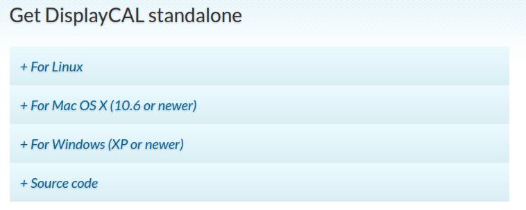
2) Click on +For Linux
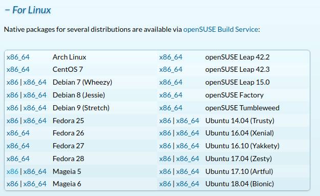
3) Select your version to download. In my case as a Linux Mint 19 user that is Ubuntu 18.04 x86_64.
4) Go to your Download folder and double click the displaycal_x.x.x.x-x_amd64.deb file.
5) Install the package (and accept the additional software that needs to be installed).
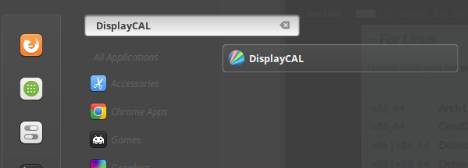
6) Check via your applications menu that DisplayCAL is indeed available now.
That’s it! Now the real fun can begin.
How to color calibrate your monitor in Linux with DisplayCAL
Now that we downloaded and installed DisplayCAL we will start it up and actually use it.
1) First plug in your colorimeter so that the software can recognize it.
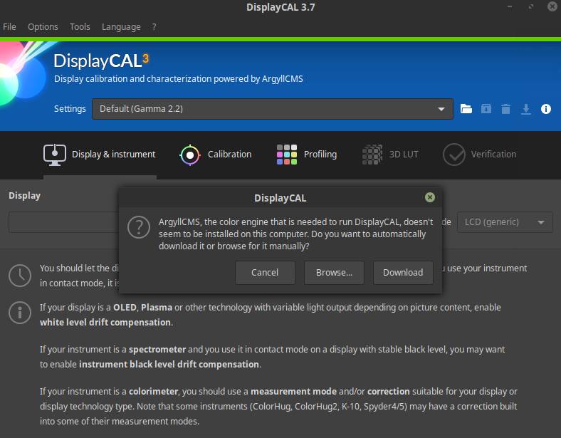
2) Start DisplayCAL.
You probably will see a message now that ArgyllCMS, the color engine that is needed to run DisplayCAL, is not yet installed on your computer.
3) Choose Download.
You will see the following pop up.
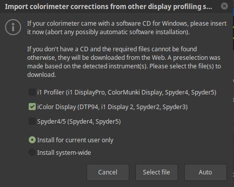
4) In my case, as an owner of the Spyder3 I select iColor Display. And select Install for current user only. Click Auto.
5) When everything has been successfully imported click OK.
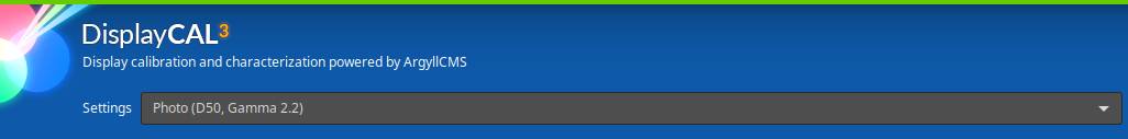
Now you will see a screen like this:

We start in the Display & Instrument tab.
6) As I want to calibrate for printed photography I put the settings on Photo (D50, Gamma 2.2).
Note: Making a correct choice about what color temperature to choose for your monitor and the setting in this application is not easy to make. During daylight hours, most people prefer to set up the monitor relatively cool with a default color temperature of 6,500K. With this setting the color white looks for most people like real white. But the fact is that there is no correct colour temperature. The colour temperature is meant to reflect specific situations. For example the higher your elevation, the higher the average colour temperature will be seen as correct. But when you set your display to 6500k when you edit your photographs, the result on paper will be more warm toned than you initially expected, because you compensate for the cool base tone of your monitor setting of 6500k. Generally speaking it is perfectly fine to set your monitor on 6500k when you create images to display on screen and of course for web to be seen on screens of other people, but if you want printed color output that matches what you see on your screen you should choose the warm base tone of 5500k or even 5000k.
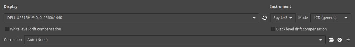
7) Choose your display. In my case it is a DELL U2515H.
8) Check that the instrument is correct.
9) Leave the rest as it is.
10) Go to the Calibration tab.
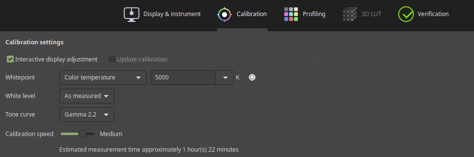
11) Make sure the values are set as being showed.
12) Go to the Profiling tab.
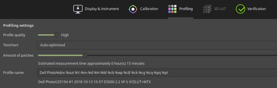
13) Rename the profile name, for example by adding in my case Dell Photo in front of the existing line.
14) Now click on Calibrate & Profile.
Now you will see a Measurement area. If it is to small for your device then click on the plus sign to make it a bit larger.
15) Put your device over the measurement area. Tilt your screen slightly backwards so that the colorimeter is pressed against the screen.
16) Click Start measurement.
Now a small screen will be shown for Interactive display adjustment.
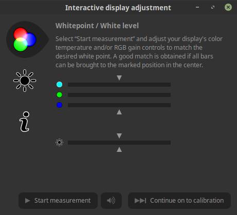
Some base measurements will be done.
17) Wait till you can click on Start measurement and then press Start measurement.
Some measurements will be done and a result will be presented.
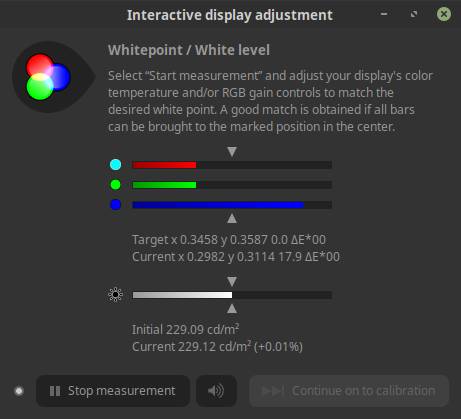
The first step is to adjust your physical screen via your on screen display options so all bars are brought as close as possible to the marked positions in the center.
18) While measurement is still active try to adjust your screen so it matches the bars.
In my specific situation I changed my monitor settings to R=90, G=88, B=90 and Brightness 60.
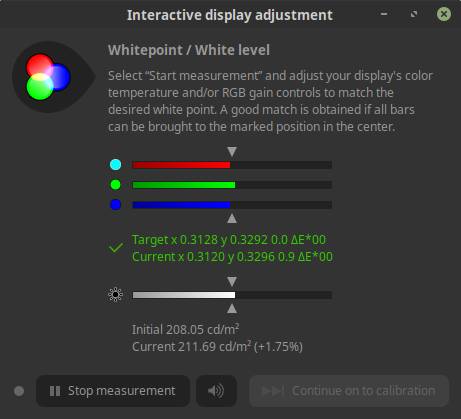
19) When you think it matches the bars as close as possible you can click Stop measurement.
20) Click Continue on to calibration.
Now the colorimeter will take different readings from the monitor while colors like black, white, red, green, blue colors and different grey tones will be shown in the measurement area. This can take between 15 minutes and a couple of hours, depending on the type of colorimeter and the selected calibration speed in step 10.
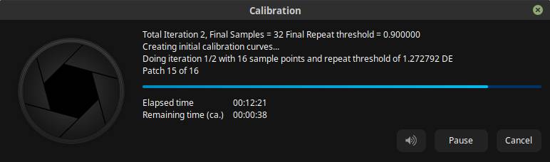
Note: keep in mind that your screen should not go into sleep mode as the colorimeter can’t take any reading anymore.
When the measurements sequence is done an Install profile screen will be shown.
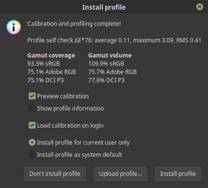
Here you can see the outcomes of the measurements. It is also possible to switch between the pre-calibration situation and the post-calibration situation to see the difference.
21) Click on Install profile.
22) Go to your systems settings and look for the Color settings in the hardware section.
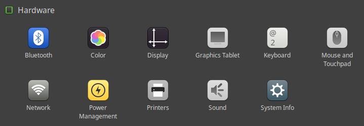
23) Open the color settings panel.
24) Select your screen and select the profile that has been created in the previous process.
That’s it! Now you can use the profile that has been created in for example GIMP.
Final words
As I started in this blog post I think that if you are a professional photographer, image maker, video editor or digital matte painter, or if you are you just passionate about your your personal digital art, it is very important that your monitor displays colors accurately, so you should calibrate your monitor with international defined standards in mind. I wrote about the importance of the objectivity of color and how to achieve this in Linux. I know this blog is not for everyone, but for those who are I hope this article was of any interest and help for you.
Till next time!
Sources
I used the following sources for this blog post:
https://www.color-management-guide.com/color-management-summary.html
https://www.color-management-guide.com/calibration-calibrate.html
https://www.color-management-guide.com/books-links-dvd-vod-color-management.html
https://www.color-management-guide.com/color-management-summary.html
https://www.youtube.com/user/boudy1966/videos
https://www.breathingcolor.com/blog/how-to-create-camera-profiles-using-the-colorchecker-passport-with-adobe-cs5/
https://hidefcolor.com/blog/color-management/what-is-lab-color-space/
http://www.color.org/index.xalter